tank130

Sugar Daddy
 Posts: 8890
|
|
« on: April 12, 2012, 05:29:26 pm » |
|
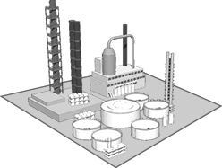
Hey guys, We could use a hand with some art work / specifically some icons. This is an example of a factory we are using.  We need similar style buildings for the following: Airport / airfield Barracks Munitions Fuel City They will be reduced down to ~32x32, so not too much detail. Black & White would be best. Please fire me off a PM if you think you can help or know of a source. |
|
|
|
|
 Logged
|
Geez, while Wind was banned I forgot that he is, in fact, totally insufferable
I'm not going to lie Tig, 9/10 times you open your mouth, I'm overwhelmed with the urge to put my foot in it.
|
|
|
8thRifleRegiment

|
|
« Reply #1 on: April 12, 2012, 05:34:30 pm » |
|
  Both for munitions, whatever you think fits better |
|
|
|
« Last Edit: April 12, 2012, 05:48:04 pm by 8thRifleRegiment »
|
 Logged
|
 I will never forget the rage we enduced together  Ohh Good, AmPm can pay in Doubloons.
|
|
|
hans

|
|
« Reply #2 on: April 12, 2012, 05:35:28 pm » |
|
if i would have had time i would actually do this but right now i got unfortunately no time
|
|
|
|
|
 Logged
|
 Also, bad analogy ground, My vegetables never pissed on my ego when I decided they defeated me and gave up on dessert.
|
|
|
Vermillion_Hawk

|
|
« Reply #3 on: April 12, 2012, 05:36:14 pm » |
|
We need similar style buildings for the following:
|
|
|
|
|
 Logged
|
What is a man? A miserable little pile of secrets.
- Andre Malraux
- Dracula
|
|
|
Falcon333

|
|
« Reply #4 on: April 12, 2012, 06:36:35 pm » |
|
How's something like this?
Is the style ok? Needs more detail? Borders not good?
|
|
|
|
« Last Edit: April 12, 2012, 06:38:14 pm by Falcon333 »
|
 Logged
|
"Chance favors the prepared mind"
|
|
|
Scotzmen

|
|
« Reply #5 on: April 12, 2012, 07:37:15 pm » |
|
Maybe, something like this?
Whipped it up in 5 mins, sorry for lack of detail.
|
|
|
|
|
 Logged
|
|
|
|
EIRRMod

Administrator / Lead Developer
 Posts: 11009
|
|
« Reply #6 on: April 12, 2012, 07:57:07 pm » |
|
  Both for munitions, whatever you think fits better They dont really look like buildings. Just sayin' |
|
|
|
|
 Logged
|
Shit I'm pretty sure you could offer the guy a cup of coffee and he'd try to kill you with the mug if you forgot sugar.
That's like offering Beer to fuck the fat chick. It will work for a while, but it's not gonna last. Not only that, but there is zero motivation for the Fat chick to loose weight.
Why don't you collect up your love beads and potpourri and find something constructive to do.
|
|
|
EIRRMod

Administrator / Lead Developer
 Posts: 11009
|
|
« Reply #7 on: April 12, 2012, 07:58:48 pm » |
|
Maybe, something like this?
Whipped it up in 5 mins, sorry for lack of detail.
If you then put a black edge on the correct parts, then rendered it down to a sprite of the correct size, itd work. Fuel dump/Oil rig would probably be an easy one to do 3d -> 2d sprite |
|
|
|
|
 Logged
|
|
|
|
tank130

Sugar Daddy
 Posts: 8890
|
|
« Reply #8 on: April 12, 2012, 08:05:56 pm » |
|
We need the icons to look more like objects. Like objects you would see on a board game or something. If you look at my factory or this example it does not have borders or anything and looks like a 3 dimensional object (kinda)   |
|
|
|
|
 Logged
|
|
|
|
Scotzmen

|
|
« Reply #9 on: April 12, 2012, 08:19:44 pm » |
|
If you then put a black edge on the correct parts, then rendered it down to a sprite of the correct size, itd work.
Fuel dump/Oil rig would probably be an easy one to do 3d -> 2d sprite
Ill see what I can do. How much detail are you actually looking for...? |
|
|
|
|
 Logged
|
|
|
|
tank130

Sugar Daddy
 Posts: 8890
|
|
« Reply #10 on: April 12, 2012, 08:25:16 pm » |
|
No More detail then you see above. Even my oil refinery is too much detail. These will be shrunk down to about 32x32 pixels, so any small detail will just get lost anyway.
To give you an idea of size: I believe the unit icons in the launcher are 64x64, so these ones are very small.
|
|
|
|
|
 Logged
|
|
|
|
Scotzmen

|
|
« Reply #11 on: April 12, 2012, 08:54:08 pm » |
|
Meh, pretty easy then. Now just to figure out how to add shading and black lines to models in max...
|
|
|
|
|
 Logged
|
|
|
|
aeroblade56

Development
 Posts: 3872
|
|
« Reply #12 on: April 12, 2012, 09:45:24 pm » |
|
|
|
|
|
« Last Edit: April 12, 2012, 11:54:46 pm by aeroblade56 »
|
 Logged
|
You are welcome to your opinion.
You are also welcome to be wrong.
|
|
|
EIRRMod

Administrator / Lead Developer
 Posts: 11009
|
|
« Reply #13 on: April 13, 2012, 12:29:47 am » |
|
I may have to resort to just placing the 'special' of a sector in the top right corner like this: And limit it to a small icon - which isnt such a problem.  |
|
|
|
|
 Logged
|
|
|
|
Unkn0wn

No longer retired
 Posts: 18379
|
|
« Reply #14 on: April 13, 2012, 03:50:42 am » |
|
|
|
|
|
|
 Logged
|
|
|
|
LeoPhone

Honoured Member
 Posts: 0
|
|
« Reply #15 on: April 13, 2012, 04:34:15 am » |
|
I may have to resort to just placing the 'special' of a sector in the top right corner like this: And limit it to a small icon - which isnt such a problem.  yes small icon better like: tank airplane soldier vcoh mp, mu, fu icons |
|
|
|
|
 Logged
|
|
|
|
Tymathee

Donator
 Posts: 9741
|
|
« Reply #16 on: April 13, 2012, 07:11:49 am » |
|
something like that could work. |
|
|
|
|
 Logged
|
"I want proof!"
"I have proof!"
"Whatever, I'm still right"
Dafuq man, don't ask for proof if you'll refuse it if it's not in your favor, logic fallacy for the bloody win.
|
|
|
tank130

Sugar Daddy
 Posts: 8890
|
|
« Reply #17 on: April 13, 2012, 08:21:03 am » |
|
I may have to resort to just placing the 'special' of a sector in the top right corner like this: And limit it to a small icon - which isnt such a problem.  Why? |
|
|
|
|
 Logged
|
|
|
|
Mister Schmidt

Lawmaker
 Posts: 5006
|
|
« Reply #18 on: April 13, 2012, 08:25:57 am » |
|
Looks better
|
|
|
|
|
 Logged
|
and 6th " Main Thing " is you have to Chant " hare krishna hare krishna krishna krishna hare hare hare rama hare rama rama rama hare hare ".
"Seeing Bigdick in his full sado mask attire, David couldn't help but feel a tingle in his special place.."
|
|
|
tank130

Sugar Daddy
 Posts: 8890
|
|
« Reply #19 on: April 13, 2012, 08:40:36 am » |
|
Looks better on what?
These are not launcher Icons. These are not forum Icons.
These are icons designed to be used on the New Warmap. A design in which the Warmap is supposed to have a board game type feel to it.
So unless we are not going with that design, the icons you think look better would look retarded........
Just sayin'
|
|
|
|
|
 Logged
|
|
|
|
|